Wednesday, December 30, 2009

Charts that Suck

Yes, I know every excel blog has a feature like this, but I'm not feeling inspired today and I need some filler.  Also this chart just plain irritated me.


Problems I have with this chart:
  1. It's 3d.
  2. The bars are all different colors.
  3. It's using the default Excel palette.  Not only is everyone bored with it by now, it was ugly to begin with.
  4. It's 3d.
  5. The key is an inefficient way to label this type of chart.
  6. I don't think these are "relative prices".  Just prices would be fine.
  7. The bars are touching!  Data needs to breathe.
  8. Vertical text.
  9. It's 3d.
  10. The "Liquids" label on the axis wouldn't be necessary if the chart was labeled correctly in the first place.
Things that I appreciate about this chart:
  1. The data is ordered in a useful way.
  2. A bar chart is the correct graph for the data, as opposed to a line graph, scatter plot, or pie chart.
  3. No wacky textures or other irritating effects were added.
Let's fix it.  First of all, change the color palette.  I could write a book about proper color palette use in Excel.  It wouldn't be terribly informative or correct, and I'd probably end up anthropomorphizing the colors and turning it into trashy cyberpunk pulp starring the color fuschia, but I could write it.  I'll put a post together about it in the distant future.  For now, here are the rules for a good color palette (I'm not intentionally making this post a series of numbered lists, it's just kind of turning out that way):
  1. White.
  2. Black.
  3. 5-10 shades of gray, ranging from very light to very dark.
  4. A strong red, something a little deeper than just the 255 red (for "bad" or negative numbers).
  5. Several monochromatic color series for ordered data.  Generally, lighter is better because you can use it for backgrounds as well.  I like blues and greens for this.
  6. A series of complementary colors for unrelated data.  Think pie chart.  I like autumn colors or colors that remind me of food for this.
Here is my current color palette.  You can see that I've broken some of my own rules, but this is a work in progress.  I'm not happy with the red series and I need more gray.


Because this is a chart about money I'm going to use a green*.  That's probably more thought than you need to put into something like this, but anything worth doing is worth doing right.  I'm just getting into all of the psychology behind color, and I'd recommend Pantone Guide to Communicating with Color as a good place to start.

The background of the chart should be very light gray or white, grid lines and borders should be gray if you want them, the actual bars should not have borders.

As far as the fonts, I like Georgia for text, Tahoma for numbers.  You might have heard that you should change the font based on whether it will be read on paper or electronically as Serifs are supposed to be easier to read in print and Sans Serifs are supposed to be easier to read on a computer screen.  This is hogwash and hasn't been supported by scientific study; Google it if you want.  Regardless of medium, Georgia is a damn fine font, though the descending numbers make it unsuitable for numbers by themselves so that is why I also use Tahoma.  I usually use 8 point font for labels, 10 point font for titles, but the scale really depends on where you're going to put it.  As a rule though, titles should be about 2 points bigger than the rest of the text for most applications.

I changed the chart to a horizontal bar chart so that the long category names would fit easily and we wouldn't have to use a key.  The bars are also a little too skinny by default.  The chart reflects the data, so if you want your data to look solid you'd better use bars that don't look like they'd snap off in a stiff breeze.  I changed the gap width to 70.

The repaired chart:


Note to self: stop leaving the mouse cursor in screen shots.  That's all for today.  In unrelated news, my girlfriend is going to buy me office 2010 for Christmas.  I'm a little scared to leave the comfort of 2003 behind, but it will be nice to have my own Excel license if I ever want to start freelancing.  Next Christmas I want Tableau.

-David
  
* I realize that not all money is green and that not all of my readers are from the United States, but U.S. currency is the most recognized currency in the world according to an unscientific poll I conducted that technically has the largest sampling bias possible.


Thursday, December 17, 2009

Enhance Excel's Autosave with a File Syncing Service

I love this tip because I invented it.  I suppose other people might do the same thing, but it would be a parallel evolution of ideas as opposed to me looking at what other Excel blogs were writing about a year ago, adding swear words, and calling it an original post.

If you use Excel extensively, you know that it has the potential to lock up or crash.  A lot.  This mostly happens to me when I'm using formula auditing, but I've also been the victim of unprovoked crashes on multiple occasions.  Losing over an hour of work is pretty much a day-ending and possibly career-ending event for me as my only tools for coping with adversity are random, shocking violence and destruction of property, so I go to great lengths to make sure this never happens.

Fortunately, Excel has an autosave feature.  Unfortunately, this feature sucks.  Depending on how Excel crashed and how you restarted it, you may or may not be given the list of recoverable documents.  Also, despite setting the autosave interval as low as 10 minutes, you'll have inexplicable gaps in coverage.  Browsing to the directory where autosaves are kept can help, but Excel seems to clean this directory out pretty regularly.

What is one to do?  Well, you should be backing up the autosave directory remotely and instantly, giving you access to every version of your Excel documents going back as far as your storage space will allow.  There are a number of programs that do this, many of them free.  A lot of people like to use Drop Box for file syncing, but Drop Box only backs up one folder unless you hack it with odd shortcuts.  I prefer SugarSync.  SugarSync can back up or sync any folder you want either with your online account only or between multiple computers.  SugarSync is free to sign up for, but if you do it with this link I get a free storage upgrade.  Please?

I'm not going to go into the details of how to set up SugarSync, suffice to say it isn't brain science.  Once you do have it set up, you need to locate your autosave directory.  In Excel, go to Tools > Options > Save.


The AutoRecover save location is the directory you want.  Keep this path handy, as SugarSync forces you to browse to the location instead of just pasting it in.  Also, make sure that autosave is enabled with a time interval that you're comfortable with.

Now in SugarSync go to Manage Sync Folders and click on Add Folders from this Computer.  From there, browse to the backup folder, usually C:\Documents and Settings\Your User Name\Application Data\Microsoft\Excel\, and check the box next to it, then hit okay.  Congratulations, you'll never lose more than x minutes of work in Excel ever again.


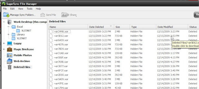
You may notice though that this folder is pretty empty.  It actually syncs up with the local folder, so it's deleting files at the same time Excel is.  It hangs on to all of these files in a deleted files folder though, so you should have every version going back quite a ways.  I think SugarSync hangs onto the files until you run out of space; I have files going back to mid-November when I last cleaned it out.


The bad thing about this system?  Well for starters you can't tell what the file is for sure until you open it because Excel assigns it a gibberish name.  If you have a rough idea of the size of the workbook and when you were last working on the version you want though, you shouldn't have too hard of a time.  The other problem is that really large files that you're working on over the course of the day will back up dozens of times and that can eat into your free space pretty quickly.  You could always register for more space, which brings me to the last negative:  SugarSync's business model may not be profitable, and they might not be around forever.  I'm sure they'll give you advance notice if the service is going down though so you don't lose all of your data, and there will always be some other free option out there to replace it, so this shouldn't be a big deal.

The great thing about this system?  It isn't just protecting you from crashes, it's protecting you from yourself.  Have you ever started working on an old workbook as a template but then hit save instead of save as, unintentionally destroying the original?  Have you ever screwed up a workbook so completely that you need to go back in time and start over?  Have you ever had a workbook out on your network mysteriously vanish?  Have you ever just plain forgotten to save a file?  If you haven't, it's probably because you're young and your brain hasn't been ravaged by alcohol, drugs, reality television, and old age.  Your probably aren't even burnt out on your job yet!  Ah, sweet ignorance... but for the rest of us, this is a great back up plan and it's saved my bacon more than I care to admit.

Also, once you have SugarSync up and running, you can go crazy synchronizing mp3s, your personal macro workbook, plug-ins, and all sorts of other stuff between your work and home computers.  It'll be like you never even left the office!

-David

Friday, December 11, 2009

Secret Santa Worksheet

I made a worksheet for everyone who wants to do a Secret Santa gift exchange but doesn't own a hat.  You type in a list of names (the gift givers), click a button, and get a new list of names (the gift receivers) randomly shuffled with no name in its previous position.  I almost decided to sell this, but several things changed my mind:
  1. My VBA coding skills are actually horrible and I'd be ashamed to profit from them.
  2. It would almost certainly complicate my taxes which I can barely do as it is.
  3. I couldn't find any terms of use for the Santa image but I was too lazy to find a replacement.
  4. The only people who would buy it would be people who read my blog, and I love you all too much to let money come between us.
So, uh, happy holidays.  I hope it fits.  What?  You want to know how it works?  Sigh...

Okay so my stupid worksheet looks like this:

Thursday, December 3, 2009

I just now turned ClearType on after scorching my retinas for years

Still alive, just really busy.  Most insurance plans renew January first, so 'tis the season.

Here is a quick tip that you probably already know about, but I'm an idiot and I just found out about it a week ago.  There is a setting in Windows XP called ClearType that makes your fonts render more smoothly.  Predictably, this is turned off by default.

I didn't know I needed glasses until I started living 1/3 of my life inside of Excel.  It isn't easy on the eyes, so you have to take care of yourself.  This setting actually makes a huge difference.  It should be on by default in Windows 7, if you have Vista you've already gouged your eyes out so it doesn't matter, so here is how to turn it on in XP:

1.  Go to Display in the Control Panel.
2.  Select the Appearance tab, then Effects.
3.  Check the box for "Use the following method to smooth edges of screen fonts", then select ClearType from the drop down list.
4.  Hit okay, apply, etc.

Just remember, it won't make your pie charts look any better.
 
Creative Commons License
David @ Work by David Montgomery is licensed under a Creative Commons Attribution-Noncommercial-Share Alike 3.0 United States License.