Posts: 12
Page Impressions: 288
Ad Clicks: 1
Comments: 1*
Google Adsense Earnings: $0.14
Amazon Associate Program Earnings: $0.00
Incidents of Paranormal Activity: 2
So I need to post a lot more, people are still reading my blog, my posts are so thorough that no one feels the need to comment, all of my readers are probably running AdBlock, and financially my blog is a runaway success. Now when people ask me if writing an Excel blog is rewarding, I can answer, "Yes, soul-crushingly so."
Enough fun, let's get down to business. Here is the data set we're going to start with:
My task was to sum up all of the claims before and after a certain point, so the first thing I want is a column that shows claims paid to date, or cumulative claims. In cell C2, type in the formula:
=sum(b$2:b2)
I'm also going to create a few cells for some markers and the actual scroll bar value. Feel free to put these anywhere on the worksheet. Seriously, go nuts. I like putting everything in column Z so that it's harder for people to peer review my work (which is already a waste of their time because I never make mistakes).
The Scroll Bar Value will be the cell that the scroll bar object is linked to later, while the Month Markers are just so I can put data labels in the middle of the month but have my tick marks on the ends of the month.
Add these three series to an XY-Chart as follows:
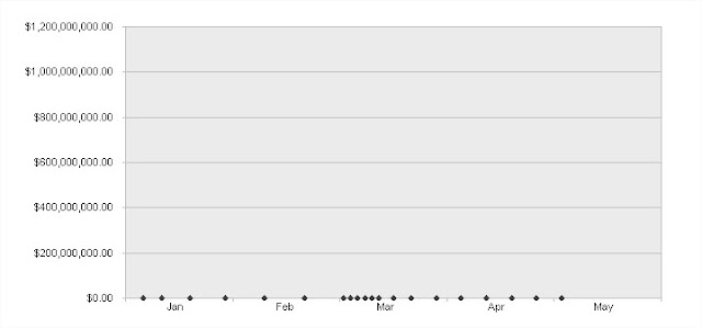
Because I chose funny values, the chart should be completely unreadable, but we're going to change the scale later so that doesn't matter too much. Double click the data point at $1 billion (Scroll Bar Value) and add an error bar to it. This should be a negative error bar only at -100%. We don't need the point at all, we're just looking for a vertical line.
After that, double click on the error bar (the vertical line below your data point) and format it in a color that stands out. I like red. Also, take the 'T' off of the end of your marker.
(Just a note about my color palette: I hate it. I like most of it, but I never use those purples. I'm tempted to add more gray or maybe some beige and off-white colors for table backgrounds, but I haven't gotten around to it yet.)
Now we can fix the scale of the chart. It looks like our dates run from January - May of 2009. Double click on your x-axis, make sure the number is formatted as a date, and then simply type in 1/1/2009 as the minimum and 5/31/2009 (there are 31 days in May, right? I hate months...), with a major unit of 30.
This should give us a nicely formatted axis:
Now double click on the x-axis again, go to patterns, and turn off the tick mark labels. We're instead going to label the mid-points, which are those little grey triangles above. To do this, you'll need an XY-Chart labeler, which I've previously discussed here. Go to the dates for your Month Marker series and format them as Custom > "mmm". After that, right click on your chart, go to JWalk Chart Tools, and select the data labels tab. From there you can link the Month Marker series to the cells we just reformatted like so:
After that, double click on your shiny new data labels, go to the alignment tab, and change the label position to "Below". After that, double click on the actual data points, set the marker to "None", and the x-axis is done.

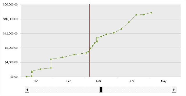
Now we just need to take care of that y-axis. It looks like our claims top out at under $18,000, so let's set the maximum for our y-axis scale to $20,000 with major increments of $4,000. After that, double click on your Cumulative Claims Series and add a line to it on the patterns tab. Now our chart is looking pretty good.
Now let's create the scroll bar. Go to the control toolbar (add it under the view menu if you don't have it), click on the Scroll Bar button, and drag out a horizontal scroll bar under your chart. You may want to turn on snap-to-grid if you'd prefer more control over the size of the bar.
Ack, tool tips in my screenshots! The next thing we're going to have to do is link the bar to a cell and give it a minimum and maximum. For the min and max, we're going to want to use the VALUE function on the first date and last date in our series. The properties of the scroll bar won't except the date format. I just used MIN and MAX because I don't trust my data not to move around, but if the data isn't sorted your line is going to look like small intestines or some other, less disgusting thing that is squiggly.
Now let's go into the scroll bar and set some values. Right click on the scroll bar and select "Properties". We have the numeric values for the beginning and end date, and we just want it to link to the same cell our Scroll Bar Value data series is linked to (Z2 for me). Your properties should look something like this:
You may have to initialize the value of the linked cell to a value between the min and the max, mine was acting a little wonky. If everything worked out, you should have a scroll bar that moves a line around your chart. Remember to turn off design mode (on the control toolbar) to interact with the scroll bar instead of just throwing it around the sheet.
I threw some formulas under the scroll bar to give some additional data:
The named range "scrollbarvalue" is pointing to cell Z2, the cell the scroll bar is linked to. Dates are the dates in column A, and paidclaims are the claim amounts in column B (not the cumulative claims). Cell C26 is the last value in the cumulative claims column, or the total paid claims for this individual over this period. The SUMIF formula is simply adding up all of the paid claims for the dates that are strictly greater than the scroll bar value, N24 is the remaining claims, and column O is showing the percentage of total claims paid. It looks like this in practice:
There you have it, a functional chart template that admittedly has few useful applications, but scroll bars will impress the people in your office that actually allow macros in Excel (actual email: "Is the scroll bar supposed to do something? Mine just looks like a little picture?!
Questions? Comments? Let me know in the, uh, comments.
-David
* My lone comment is actually from Jon Peltier, so I consider this a win.


No comments:
Post a Comment